Exploring Analytics
The analytics features in SimpleKPI are designed to help you explore your data, uncover insights, and investigate the numbers behind the trends—all in a simple, user-friendly way.
Analyzing your KPIs
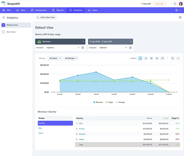
- To begin analyzing, select your KPI using the KPI Selector. You can scroll through or search to find the one you need.
- Select a date range using the calendar control. The chart window will automatically update to display your KPI data across the selected period.
Hover over any point on the graph to see detailed figures for that specific time.
By default, the chart view displays the overall KPI values. To focus on specific users or groups:
- Click the User or Group dropdown and select the filters you want to apply.
- Click Done to update the view.
The chart will now show KPI values filtered by your selections. To clear the filters, de-select the values and click Done.
Date Controls
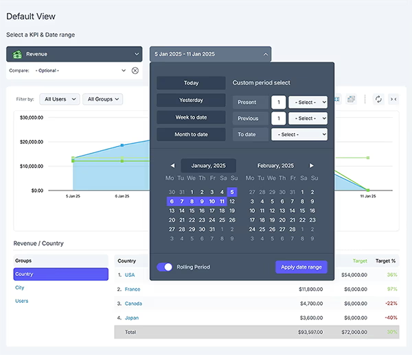
The date controls let you choose from preloaded periods or set a custom date range:
- Click the Date dropdown.
- Choose a standard period or select Date Range to set your own range.
- Use the calendar controls to pick a start and end date, then click Done.
The graph will update to display data for your selected date range.
Using Groups and Filters
The data breakdown section below the chart shows how the data is structured. Groups like departments or locations appear on the left, and the data breakdown for the selected group appears on the right.
- Click a group name (e.g., Countries) to see a breakdown of its data.
- You can drill down further to see subcategories, like cities, and their corresponding performance data.
Use this feature to explore trends, anomalies, and opportunities within your data.
Drilling Down
To investigate performance at a more granular level, drill down into group data:
- Click on a group in the left-hand panel (e.g., departments or teams).
- The right-hand panel will update to show detailed data for the selected group.
Drill-down data affects only the table below the chart and not the main graph itself.
Saving Analytics Views
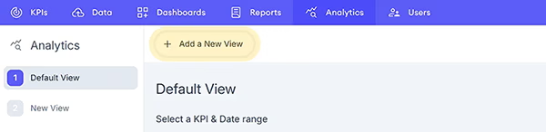
Once you've configured your chart and filters, you can save your view for easy access later:
- Click the Save as a new view button in the top actions menu
- Enter a name for your view and save it.
- Your saved views will now appear in the menu on the left. You can edit or delete them by hovering over the view name and using the icons.