
Charts are the heart of a dashboard. Each one shows a KPI (or a few) as a line, column, gauge, or table, so trends and targets are easy to read. You add and shape charts in a side panel with a live preview, so you see exactly what you're building before you commit.
Add a chart
- Open the dashboard you want to add to.
- Select Add a chart in the top-right of the toolbar. The chart editor slides in from the right.
- Under Select a KPI or Metric, pick the KPI you want to show.
- Set a date range to control the period the chart covers.
- In Build your chart, give it a title and choose a chart type from the type dropdown — grouped into Charts & Gauges and, where available, Data Views and Lists.
- When the preview looks right, select Add.
Nothing is saved until you select Add, so feel free to experiment. Select Cancel to back out with no changes.

Fine-tune the look
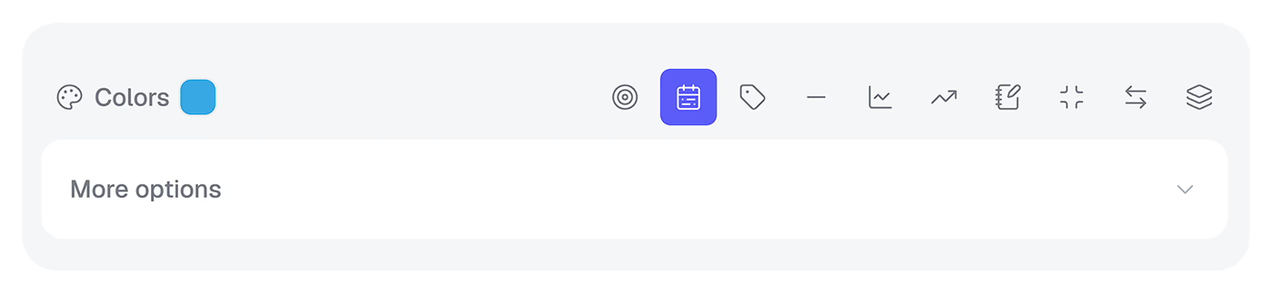
The editor gives you more control when you want it. Change series Colors, switch how the data is grouped with View by, and open More options for RAG thresholds and Y-axis limits. Need to narrow the data? Open the Filters & Breakdowns section to focus on specific groups or items.

Arrange your charts
Back on the dashboard, drag any chart by its handle to move it, and drag its corner to resize it — the grid keeps everything tidy. Each chart also has a menu (the three-dots button) to Edit, Copy, Share, or Delete it.
Use Compare next to the KPI or date to overlay a second KPI or an earlier period — a quick way to show progress. Dashboards have a limit on the number of charts, so if you hit it, start a second dashboard to keep each one focused.