Back Dashboards
- Creating Dashboards
- Dashboard Settings
- Sharing Dashboards
- Embedding charts externally
- Dashboard charts
- Dashboard Gauges
- Full Screen Mode
Adding and Customizing Dashboard Charts
SimpleKPI offers an array of dashboard graphs, charts and controls to help visualize KPI performance.
Contents
Adding a new graph
In a few simple steps you can populate your dashboard with meaningful charts and graphs:
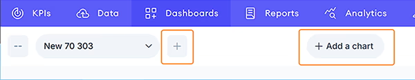
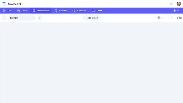
- Click the dashboards Tab
- To add a new dashboard click the + icon
- To add a new graph or chart click the 'Add a new chart' button
- From the view drop down menu, select a graph or control type
View Edit Screen
The screen will now display the edit mode for your chosen graph type. The screen consists of 4 areas:
- The KPI Selector
- The Date Control
- The Options Menu
- The Preview window
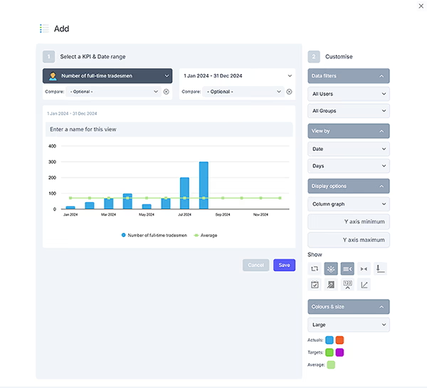
- To begin editing your graph type select the KPI you wish to use from the Select a KPI drop-down
- Choose the period of time you wish to use for this view using the date control
- Customize your view by using the options menu
- The preview will show how the chart will look before it is added to the dashboard. To add the view to your dashboard click the Add to my Dashboard button
you can move your new view to a new location on the dashboard by clicking and dragging the header bar.
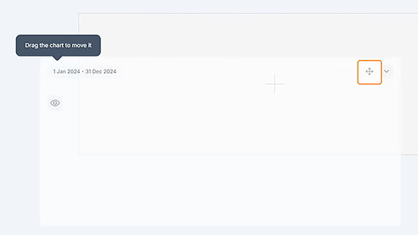
- To edit a view click the edit icon located in the top right of each view
- To delete a view click the delete icon located in the top right of the view
Options
The right hand options menu enables you to customize the chart settings to display the view exactly as you would like to see it.
The options menu comes with the following settings:
- View Name: Add a name to your view
- Filter by Users: Show the data filtered by one or many users
- Filter by Group: Show the data for the selected groups only
- Size: Choose a size for the view on the dashboard
- Display by: Either displays the chart by date or by groups
- Frequency: How you would like to see the dates segmented
- Graph Type: Choose the graph type you would like to use
Additional Options:
- Colors: Customize the Target, Actual and Averages for each view
- Reverse target: Flip the target on the x axis
- Show target: Toggles the target in the graph on and off
- Show Average: Toggles the average on and off
- Use same Y axis: Useful when comparing KPIs, it sets a standard y axis
- Reduce Y axis: Stretches the graph when values are very similar