- Creating Dashboards
- Dashboard Settings
- Sharing Dashboards
- Embedding charts externally
- Dashboard charts
- Dashboard Gauges
- Full Screen Mode
Creating Dashboards
KPI dashboards are powerful tools that transform raw data into actionable insights by visualizing your metrics and KPIs in a clear, consolidated view. This is where you can spot trends, monitor progress, and make smarter decisions.
Dashboards can be created by any user on the account. However, users will only see the data they have entered for their own KPIs. Directors, Admins, and Owners have access to all data and KPIs across both their own and shared dashboards.
Adding a New Dashboard
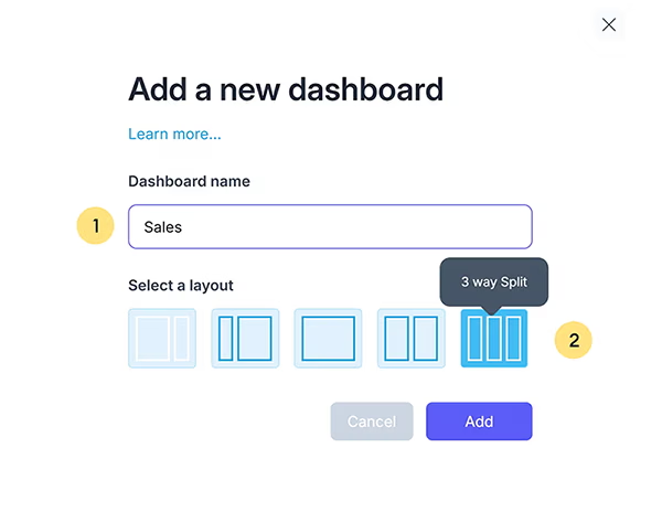
- Click on the 'Plus Icon' to create a new dashboard.

- Give your dashboard a unique name.
- Select a grid layout. More on grid layouts can be found here.

Selecting Charts and Graphs
Charts and graphs are essential for effectively visualizing your metrics and KPIs. They allow you to present data in a clear and intuitive way, helping to highlight trends, performance levels, and actionable insights. From bar charts for comparisons to line graphs for tracking progress over time, selecting the right chart type ensures your data is both informative and visually engaging.
- Click the 'Add a Chart' button in the dashboard header.
The available charts are listed in the header and include options ranging from simple bar and line graphs to gauges and reports. You can explore an overview of each chart by hovering over its icon. Learn more about Charts and Gauges.

- Click a chart icon to start customizing the chart.
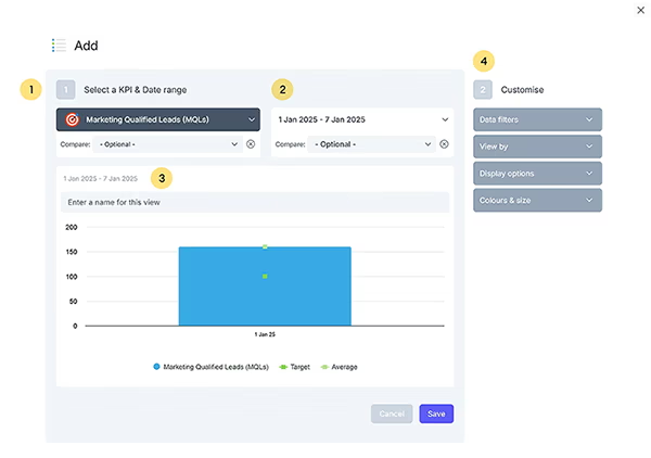
The chart builder is divided into two areas: the left-hand side, where you can select the KPI, date range, and preview the chart, and the right-hand side, where you can customize chart details such as filters, colors, and other options.

- Click and select a KPI from the KPI dropdown list.
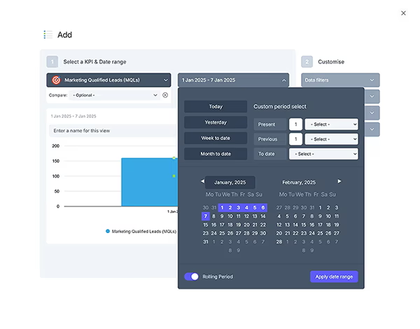
- Choose a date range by clicking the date range dropdown. Learn more about the date range control here.

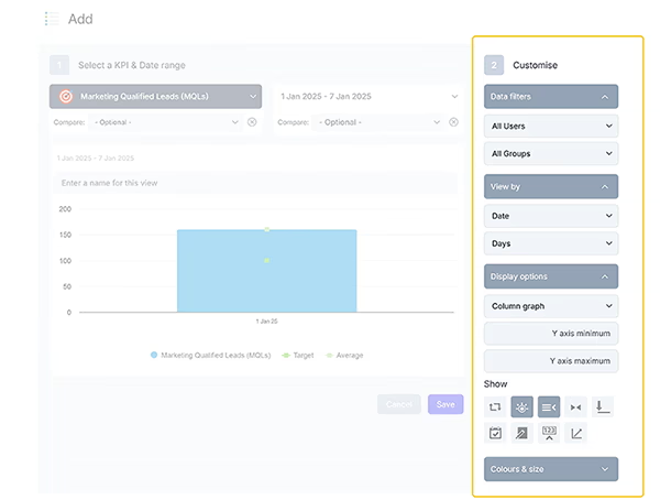
From the menu on the right, you can customize the chart with the following options:
- Data Filters: Filter the data in the chart by single or multiple users, or by groups. More on groups can be found here.
- Choose to view by: Dates or groups, which affect how the axis is constructed, and set frequencies such as days, months, or years.
- Display Options: Customize axis values or include chart items like targets, averages, notes, and values.
- Colors and Sizes: Adjust the chart colors and size to suit your preferences.

More Information About Dashboards
Dashboards in SimpleKPI offer much more than just visualizing your KPIs. With features like Dashboard Settings, you can customize layouts, manage data visibility, and tailor the dashboard experience to suit your needs. Sharing is seamless, allowing you to collaborate effortlessly through Sharing Dashboards, or by Embedding Charts Externally into other platforms or presentations.
Visualization tools, such as Dashboard Charts and Dashboard Gauges, enable you to present data dynamically, ensuring important insights are both accessible and impactful. Additionally, the Full Screen Mode transforms your dashboards into powerful presentation tools, ideal for meetings and reports. These features combine to make your dashboards versatile, collaborative, and highly effective in driving decisions.